Project Overview
Project Overview
Project Overview
ROLE
ROLE
Visual Designer
Visual Designer
TIMELINE
TIMELINE
~1 month
~1 month
TEAM
TEAM
5 members
5 members
PROJECT TYPE
PROJECT TYPE
Logo Design
Logo Design
ABOUT THE PROJECT
ABOUT THE PROJECT
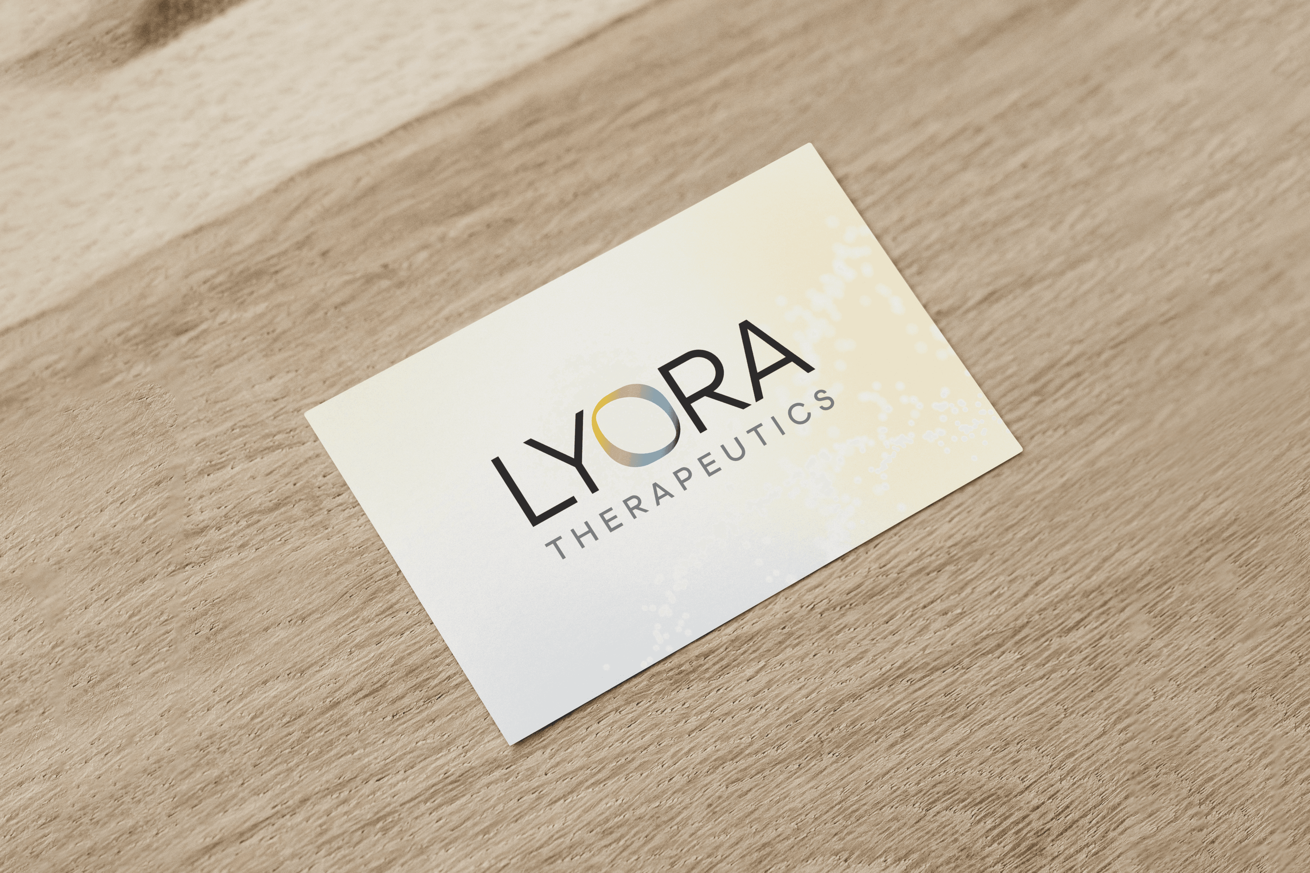
Lyora Therapeutics is a genetic therapy ophthalmology company. For this project, I was asked to create a custom wordmark that communicated the brand's mission in a simple and recognizable way.
Lyora Therapeutics is a genetic therapy ophthalmology company. For this project, I was asked to create a custom wordmark that communicated the brand's mission in a simple and recognizable way.
THE CHALLENGE
THE CHALLENGE
This project called for a simple wordmark that subtly referenced ophthalmology without leaning into anything too literal.
This project called for a simple wordmark that subtly referenced ophthalmology without leaning into anything too literal.

Research & Discovery
Research & Discovery
Early exploration focused on simple, modern typography with strong legibility and a balanced visual weight.
Early exploration focused on simple, modern typography with strong legibility and a balanced visual weight.

Refinement
Refinement
I refined the typography and developed a custom “O” as a subtle reference to vision and the eye. The final direction paired this detail with a lighter sans serif to keep the identity clean and approachable.
I refined the typography and developed a custom “O” as a subtle reference to vision and the eye. The final direction paired this detail with a lighter sans serif to keep the identity clean and approachable.


Final Outcome
Final Outcome
The final mark balances the rounded “O” with sharper letterforms to create a sense of warmth and precision. The “O” was also extended into the broader visual system as an image container across the website.
The final mark balances the rounded “O” with sharper letterforms to create a sense of warmth and precision. The “O” was also extended into the broader visual system as an image container across the website.
Let’s Connect!
Let’s Connect!
Let’s Connect!
Let’s Connect!
Let’s Connect!
Reach out with questions, ideas, or just to say hi.
Reach out with questions, ideas, or just to say hi.
Reach out with questions, ideas, or just to say hi.
Reach out with questions, ideas, or just to say hi.
Reach out with questions, ideas, or just to say hi.